
Utilizing the newer SAS graphical procedures such as SGPLOT and SGPANEL rather than the original SAS Graph procedures is becoming more and more popular in statistical programming through their many user friendly utilities, such as overlaying multiple graphics and adding reference lines with ease. However, as with its predecessor, SAS Graph, any requirement for restructure of the graphical elements still proves to be relatively rigid when sticking to these core graphical procedures. This usually results in creating bespoke program code for each figure which undoubtedly takes time and also runs the risk of inconsistencies across figures.
PROC TEMPLATE is a powerful tool which can be used to create a bespoke figure using robust SAS programming. The figure template is the scaffolding for your read-in data. The template is capable of controlling every visual aspect of the graphical field. Gone are the days of creating annotated datasets or settling for the ancient SAS graph visuals for the sake of utilising GSLIDE and GREPLAY. PROC TEMPLATE allows any figure type to overlay in one plotting space and lattice any figure type side by side.
There is a seemingly endless library of options and settings that can be applied when coding a template using PROC TEMPLATE. This blog focuses on the basic syntax and options used in template coding.
PROC TEMPLATE and SGRENDER in a Nutshell
PROC TEMPLATE uses the Graphical Template Language (GTL) which is by no means an easy task to master. This procedural language is fairly complex and requires a large dependency on outsourced materials to identify and implement the tools required to create a template. Those who are well versed in the new SG procedures may notice some overlap in syntax when programming a template. Once you have designed your figure shell in PROC TEMPLATE, you can then call it using the complementary procedure SGRENDER.
PROC TEMPLATE Example output
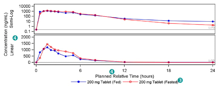
The below figure is an example of a custom graphic defined using PROC TEMPLATE. The structure of this 3 panel figure may appear similar to output achieved using the popular PROC SGPANEL tool. However, a key restriction with SGPANEL is that you cannot alter the graphics you display in each panel of your figure. PROC TEMPLATE allows you to choose how many panels you want to have and what you want to plot in each panel.
Moreover, SGPANEL does not support different scales across an axis. This is not an issue when using PROC TEMPLATE. Below, the x-axis has an alternate scale in each panel.
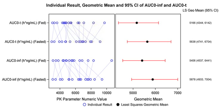
The ability to include text becomes far more effective when using PROC TEMPLATE. It avoids the need to use annotate datasets to float text which can often be a challenge to align and program robustly. In particular, this is achieved in the below figure by removing the panel walls, tick markers, and tick values of the final panel. The Geometric means and 95% Confidence intervals are then physically plotted as character markers.
An Example of Typical PROC TEMPLATE Structure and Syntax
PROC TEMPLATE is syntactically similar to the new SG procedures. This is because every single new SG procedure has a very basic, underlying template as a basis for the graphic visuals. The below code is a good basis to begin programming your first template. There is an endless list of options and formats which can be changed in the visuals.
proc template;
define statgraph example1;
begingraph;
layout lattice / columns=1 rows=2 rowdatarange=union columndatarange=union;![]()
/*Nested layout: first panel*/
layout overlay;![]()
referenceline y=0.25 / curvelabel='LLOQ’ curvelabellocation=inside
curvelabelattrs=(size=5pt);
seriesplot x=pctptnum y=meanfed / lineattrs=(color=blue pattern=solid);
scatterplot x=pctptnum y=meanfed / markerattrs=(color=blue symbol=circlefilled size=7px);
.
.
.
endlayout;
/*Nested layout: second panel*/
layout overlay;![]()
referenceline y=0.25 / curvelabel='LLOQ' curvelabellocation=inside
curvelabelattrs=(size=5pt);
seriesplot x=pctptnum y=meanfed / lineattrs=(color=blue pattern=solid)
.
.
.
endlayout;
endlayout;
endgraph;
end;
run;
| Use layout lattice to display complex potentially unique figures side-by-side. Specify a union using the rowdatarange and columndatarange options to share axes between panels. | |
| Use layout overlay blocks to create the lattice panel-by-panel. Pass plotting functions within each block such as referenceline, scatterplot, seriesplot etc. These plots will be overlayed on top of each other in the order that they are specified within the layout block. | |
| Use the layout globallegend block to add one single legend containing all plotted items in each panel. Use the mergedlegend function within this block to combine the scatterplot marker with the seriesplot line into one legend item. | |
| |
Use the columnaxes and rowaxes blocks to specify each axes in a lattice layout. Use the sidebar block to add a global axis label to the lattice. |

References
- Pratt, Jess M. “The Graph Template Language: Beyond the SAS/GRAPH Procedures.” SAS Global Forum Paper Number Paper 285-2012. (http://support.sas.com/resources/papers/proceedings12/285-2012.pdf)
- Mantage, Sanjay. “Introduction to the Graph Template Language.” SAS Global Forum Paper Number 313-
- (http://www.wuss.org/proceedings09/09WUSSProceedings/papers/dpr/DPR-Matange1.pdf)
- Żywno, Konrad. Kutyła, Bartosz. “A SAS Macro to Generate High Quality Enhanced Kaplan-Meier Plots using Graphic Template Language” phUSE Paper number CS03-2013. (http://www.phusewiki.org/docs/2013%20CS%20papers/CS03.pdf)
Subscribe to the Blog
FOLLOW QUANTICATE ON:


© 2024 Quanticate