Utilising the newer SAS graphical procedures such as SGPLOT and SGPANEL rather than the original SAS Graph procedures is becoming more and more popular in statistical programming through their many user friendly utilities, such as overlaying multiple graphics and adding reference lines with ease. However, as with its predecessor, SAS Graph, any requirement for restructure of the graphical elements still proves to be relatively rigid when sticking to these core graphical procedures. This usually results in creating bespoke program code for each figure which undoubtedly takes time and also runs the risk of inconsistencies across figures.
PROC TEMPLATE is a powerful tool which can be used to create a bespoke figure using robust SAS programming. The figure template is the scaffolding for your read-in data. The template is capable of controlling every visual aspect of the graphical field. Gone are the days of creating annotated datasets or settling for the ancient SAS graph visuals for the sake of utilising GSLIDE and GREPLAY. PROC TEMPLATE allows any figure type to overlay in one plotting space and lattice any figure type side by side.
There is a seemingly endless library of options and settings that can be applied when coding a template using PROC TEMPLATE. This blog introduces the basic syntax and features of PROC TEMPLATE for customising SAS graphics, and goes on to explore creating interactive HTML5 visuals, integrating JavaScript, and using PROC JSON to output data for web-based charting libraries such as Highcharts. Practical examples, including animated bar charts and waterfall plots, help illustrate these concepts.
SAS Graphics and Template Programming
This section explores the fundamental concepts and processes involved in creating high-quality graphics with SAS’s Graph Template Language (GTL). It explains the core components of GTL, such as layout structures, titles, and style customisation, and provides an overview of the PROC TEMPLATE and SGRENDER procedures used to design and render graphical templates.
Core GTL & ODS Graphics Fundamentals
Understanding the core building blocks of the Graph Template Language (GTL) is essential for developing consistent, flexible, and high-quality graphics. At the heart of every GTL-based figure is the BEGINGRAPH block, which defines the boundaries of the graphical output region. Everything visual, layouts, titles, footnotes, plots, and legends must reside within this block.
begingraph;
/* Layouts, plots, legends, axes go here */
endgraph;
Layouts provide structure within the graph. Commonly used containers include layout overlay for layering multiple plots on the same axis system, and layout lattice for arranging multi-panel figures in a grid format. These can be nested to achieve complex arrangements, and properties like rowdatarange=union help ensure axis alignment across panels.
To include figure titles and footnotes directly in the template, use entrytitle and entryfootnote. These offer greater control than traditional TITLE and FOOTNOTE statements and support formatting via options like halign, textattrs, and color settings.
entrytitle "Plasma Concentration Over Time";
entryfootnote halign=left "Study XYZ-123";
Style overrides are another powerful GTL feature. These allow fine-tuning of visual elements inline, such as changing font size, weight, and color in text objects, or adjusting line and marker styles using lineattrs, markerattrs, and fillattrs. Templates can also override default ODS styles for consistent branding or accessibility compliance.
entrytitle textattrs=(size=12pt weight=bold color=darkblue) "PK Profile";
PROC TEMPLATE and SGRENDER in a Nutshell
PROC TEMPLATE uses the Graphical Template Language (GTL) and those who are well versed in the new SG procedures may notice some overlap in syntax when programming a template. Once you have designed your figure shell in PROC TEMPLATE, you can then call it using the complementary procedure SGRENDER.
Comprehensive Examples of PROC TEMPLATE Graphs
PROC TEMPLATE Example Output
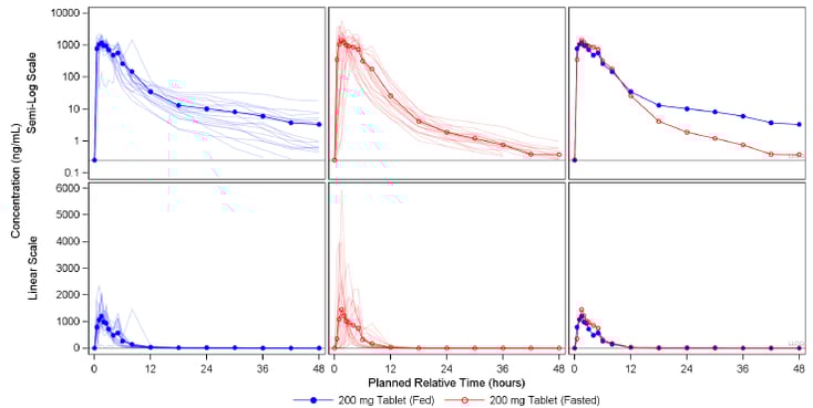
The below figure is an example of a custom graphic defined using PROC TEMPLATE. The structure of this 3 panel figure may appear similar to output achieved using the popular PROC SGPANEL tool. However, a key restriction with SGPANEL is that you cannot alter the graphics you display in each panel of your figure. PROC TEMPLATE allows you to choose how many panels you want to have and what you want to plot in each panel.
Moreover, SGPANEL does not support different scales across an axis. This is not an issue when using PROC TEMPLATE. Below, the x-axis has an alternate scale in each panel.
The ability to include text becomes far more effective when using PROC TEMPLATE. It avoids the need to use annotate datasets to float text which can often be a challenge to align and program robustly. In particular, this is achieved in the below figure by removing the panel walls, tick markers, and tick values of the final panel. The Geometric means and 95% Confidence intervals are then physically plotted as character markers.
An Example of Typical PROC TEMPLATE Structure and Syntax
PROC TEMPLATE is syntactically similar to the new SG procedures. This is because every single new SG procedure has a very basic, underlying template as a basis for the graphic visuals. The below code is a good basis to begin programming your first template. There is an endless list of options and formats which can be changed in the visuals.
proc template;
define statgraph example1;
begingraph;
layout lattice / columns=1 rows=2 rowdatarange=union columndatarange=union;![]()
/*Nested layout: first panel*/
layout overlay;![]()
referenceline y=0.25 / curvelabel='LLOQ’ curvelabellocation=inside
curvelabelattrs=(size=5pt);
seriesplot x=pctptnum y=meanfed / lineattrs=(color=blue pattern=solid);
scatterplot x=pctptnum y=meanfed / markerattrs=(color=blue symbol=circlefilled size=7px);
.
.
.
endlayout;
/*Nested layout: second panel*/
layout overlay;![]()
referenceline y=0.25 / curvelabel='LLOQ' curvelabellocation=inside
curvelabelattrs=(size=5pt);
seriesplot x=pctptnum y=meanfed / lineattrs=(color=blue pattern=solid)
.
.
.
endlayout;
endlayout;
endgraph;
end;
run;
| Use layout lattice to display complex potentially unique figures side-by-side. Specify a union using the rowdatarange and columndatarange options to share axes between panels. | |
| Use layout overlay blocks to create the lattice panel-by-panel. Pass plotting functions within each block such as referenceline, scatterplot, seriesplot etc. These plots will be overlayed on top of each other in the order that they are specified within the layout block. | |
| Use the layout globallegend block to add one single legend containing all plotted items in each panel. Use the mergedlegend function within this block to combine the scatterplot marker with the seriesplot line into one legend item. | |
| |
Use the columnaxes and rowaxes blocks to specify each axes in a lattice layout. Use the sidebar block to add a global axis label to the lattice. |

Reusable GTL Macros for Consistent, Maintainable Graphics
This example demonstrates how to generate a reusable, accessible panel plot using PROC TEMPLATE and PROC SGRENDER, wrapped inside a macro for flexibility. The plot output is saved as an HTML5 file with embedded SVG graphics.
To ensure the output is clean and web-accessible, we begin by closing any existing ODS destinations and configuring a temporary HTML5 output file. The use of the SVG device enables crisp vector graphics, suitable for modern reporting formats:
ods _all_ close;
options dev=svg;
goptions xpixels=0 ypixels=0;
filename eghtml "C:\Your\Path\pk_plot.html";
ods html5(id=eghtml) file=eghtml
options(bitmap_mode='inline')
encoding='utf-8'
style=htmlblue
nogtitle
nogfootnote;
Step 1: Creating a Simulated PK Dataset
A mock dataset is created using DATA step logic. The dataset contains repeated measures of drug concentration (conc) over time (aval) for different treatments and analytes:
data adpc;
do subject = 1 to 6;
treatment = ifc(mod(subject,2)=0, "Treatment A", "Treatment B");
analyte = ifc(subject <= 3, "Analyte X", "Analyte Y");
do aval = 0, 1, 2, 4, 8, 12, 24;
conc = round(20*exp(-0.2*aval) + rannor(1234), 0.1);
output;
end;
end;
run;
Step 2: Defining a Reusable Plot Macro
The %panel_plot macro encapsulates reusable code for rendering a panel plot using PROC TEMPLATE. It dynamically builds a lattice layout with overlaid line and scatter plots. Each panel can represent a different subgroup, e.g., analyte or subject.
%macro panel_plot(data=, yvar=, xvar=, group=, panelvar=,
colors=blue red green, ylab=, xlab=, title=);
proc template;
define statgraph panel_template;
begingraph;
entrytitle "&title";
layout lattice / columns=1 rows=2 rowgutter=10;
layout overlay / xaxisopts=(label="&xlab")
yaxisopts=(label="&ylab");
seriesplot x=&xvar y=&yvar / group=&group
lineattrs=(pattern=solid)
name="plot1";
scatterplot x=&xvar y=&yvar / group=&group
markerattrs=(symbol=circlefilled size=6px);
endlayout;
layout overlay / xaxisopts=(label="&xlab")
yaxisopts=(label="&ylab");
seriesplot x=&xvar y=&yvar / group=&group
lineattrs=(pattern=shortdash)
name="plot2";
scatterplot x=&xvar y=&yvar / group=&group
markerattrs=(symbol=trianglefilled size=6px);
endlayout;
sidebar / align=bottom;
discretelegend "plot1" "plot2" / title="Treatment";
endsidebar;
endlayout;
endgraph;
end;
run;
proc sgrender data=&data template=panel_template;
run;
%mend panel_plot;
Step 3: Rendering the Plot
Finally, the macro is called to generate the plot, using the previously created dataset adpc. Treatment groups are plotted in separate styles, and two panels are automatically generated for each analyte:
%panel_plot(
data=adpc,
yvar=conc,
xvar=aval,
group=treatment,
panelvar=analyte,
colors=blue red green,
ylab=Concentration (ng/mL),
xlab=Time (hr),
title=PK Profile by Treatment
);

Forest Plot
Forest plots are a common visualisation in clinical research, particularly useful for displaying effect estimates and their confidence intervals across individual patients or treatment subgroups. The code snippet below demonstrates how to define a forest plot using PROC TEMPLATE, followed by rendering it with PROC SGRENDER.
proc template;
define statgraph forest_template;
begingraph;
entrytitle "Forest Plot by Treatment";
layout overlay / yaxisopts=(type=discrete reverse=true
label="Patient")
xaxisopts=(label="Effect Estimate");
scatterplot y=patient x=effect /
xerrorlower=lower
xerrorupper=upper
group=treatment
markerattrs=(symbol=squarefilled);
referenceline x=1 / lineattrs=(pattern=shortdash);
endlayout;
endgraph;
end;
run;

The template uses a scatterplot statement with xerrorlower and xerrorupper options to represent confidence intervals and employs the group= option to distinguish treatment arms through colour or marker variation. The y-axis is set to display discrete patient identifiers in reverse order, placing the first subject at the top of the graph, which aligns with common forest plot conventions. Additionally, a vertical reference line is added at x=1 using the referenceline statement, indicating the point of no effect. This GTL based approach is highly customisable and integrates well into automated workflows for clinical reporting.
Kaplan–Meier Plots
Kaplan–Meier (KM) plots are a standard graphical method in clinical research for visualising survival probabilities over time. These curves depict the proportion of subjects who have not yet experienced an event (such as death, disease progression, or dropout) at each point in time.
The example below demonstrates how KM curves can be implemented using SAS GTL. The PROC LIFETEST procedure generates survival estimates by treatment group, and the GTL template defines a clean, interactive plot with step and scatter elements for clarity.
proc template;
define statgraph km_template;
begingraph;
entrytitle "Kaplan-Meier Survival Curve by Treatment";
layout overlay / xaxisopts=(label="Time (Days)")
yaxisopts=(label="Survival Probability"
linearopts=(viewmin=0 viewmax=1));
stepplot x=time y=survival / group=treatment
name="SurvivalCurve";
scatterplot x=time y=survival / group=treatment
markerattrs=(symbol=plus size=6)
tip=(time survival)
tiplabel=(time="Time" survival="Survival")
includemissinggroup=false;
discretelegend "SurvivalCurve" / title="Treatment";
endlayout;
endgraph;
end;
run;

Waterfall Plot
Waterfall plots are commonly used to visually represent individual patients' responses to a treatment. In these charts, each patient is represented by a vertical bar, ordered by the magnitude of response. This format highlights inter-patient variability and offers an intuitive way to assess treatment efficacy. In oncology research, waterfall plots are frequently used to illustrate changes in tumor size before and after therapy.
The following example demonstrates how to construct a waterfall plot. A simulated dataset is created with percentage change values (response) for individual subjects, and a treatment group is assigned. The bars are ordered by response magnitude, and colour-coded by treatment group. This clear graphical summary enables visual assessment of responders versus non-responders and highlights the proportion of subjects with meaningful clinical benefit.
proc template;
define statgraph waterfall_template;
begingraph;
entrytitle "Waterfall Plot of Treatment Response";
layout overlay / xaxisopts=(label="Subject (Ordered by
Response)")
yaxisopts=(label="Percent Change from
Baseline");
barchart x=barorder y=response / group=treatment
dataskin=gloss
barwidth=0.8
name="bars";
discretelegend "bars" / title="Treatment";
endlayout;
endgraph;
end;
run;

PK/PD Overlay Plots
Pharmacokinetic/pharmacodynamic (PK/PD) overlay plots are a powerful method for illustrating how drug concentrations relate to physiological responses over time. The SAS GTL code used to produce this composite plot is adapted from the methodology presented in PharmaSUG 2017 DV07. The PharmaSUG article demonstrates how synchronised reference lines, layered band and series plots, and inset layouts can be used to build interactive dashboards that clearly communicate PK/PD relationships across study timepoints.
proc template;
define statgraph stdplot;
begingraph / designwidth=1400px designheight=1200px;
layout overlay / width=1200px height=1000px
xaxisopts=(label="Frequency (Hz)" offsetmin=0.005
offsetmax=0.005
linearopts=(viewmin=0 viewmax=200
tickvaluesequence=(start=0 end=200 increment=20)))
yaxisopts=(label="Spectral Power (Amplitude)"
linearopts=(viewmin=60 viewmax=200
tickvaluesequence=(start=60 end=200 increment=20)));
entry "Spectral Profile" / valign=top;
seriesplot x=frequency y=differenceMean / group=treatment;
bandplot x=frequency limitupper=upperlim limitlower=lowerlim
/ group=treatment datatransparency=0.5;
referenceline y=100 / lineattrs=(thickness=2 color=black);
scatterplot x=x_labelpos y=y_labelpos / markercharacter=textdisplay
markercharacterattrs=(size=15);
/* Nested layout for PK panel */
layout gridded / border=false autoalign=(topleft)
width=400px height=300px;
layout overlay /
xaxisopts=(label="Time" linearopts=(viewmin=0
viewmax=1500
tickvaluesequence=(start=0 end=1500 increment=250)))
yaxisopts=(label="ng/ml");
entry "PK" / valign=top;
seriesplot x=time y=pk_mean;
scatterplot x=time y=pk_mean / yerrorlower=pk_lower
yerrorupper=pk_upper;
referenceline x=vline_position / lineattrs=(thickness=2
color=red);
endlayout;
endlayout;
endlayout;
endgraph;
end;
run;

Modern Interactive Graphics and Web Integration in SAS
This section covers SAS’s advanced capabilities for creating modern, interactive graphics optimised for the web. It explores the use of the ODS HTML5 destination to produce scalable, animated SVG visuals, integration with JavaScript for enhanced interactivity, and the generation of JSON output for web applications. Additionally, it highlights SAS Viya’s drill-down features for dynamic data exploration and demonstrates how to use the SGDESIGN procedure to automate graph generation from templates created in the ODS Graphics Designer.
ODS HTML5 Graphics in SAS
SAS provides powerful capabilities for generating modern, web-friendly graphics through the ODS HTML5 destination. This method produces scalable vector graphics (SVG) that are interactive, responsive, and well-suited for embedding in HTML documents or sharing in web-based reports. Unlike traditional ODS HTML, the HTML5 destination supports advanced styling, animation, and JavaScript integration, making it ideal for dynamic data visualisation.
Below is an example adapted from Take a Dive into HTML5, demonstrating how to use ODS HTML5 with PROC GCHART to create an animated grouped bar chart showing adverse event (AE) counts by treatment arm and System Organ Class (SOC).
options svgheight='400px' svgwidth='600px';
goptions reset=all device=svg;
options printerpath=svg
animate=start
animduration=3
svgfadein=1
animloop=1
animoverlay
nodate
nonumber;
ods html5 path="."
file="animated_ae_by_arm.html"
options(svg_mode="inline");
title "Adverse Events by System Organ Class";
proc gchart data=ae_counts;
by arm;
vbar soc / sumvar=ae_count
sum
raxis=axis1
maxis=axis2
patternid=midpoint
width=15;
axis1 order=(0 to 20 by 5) label=('AE Count');
axis2 label=('System Organ Class');
run;
quit;
options animate=stop;
ods html5 close;
As shown above, HTML5 enhances SAS visual output with interactivity and animation. To further elevate user experience and interactivity, HTML5 graphics can be seamlessly extended using JavaScript.
JavaScript
JavaScript is a versatile programming language widely used in web browsers to create interactive and dynamic content. It supports real-time updates, user interactions, and asynchronous communication. It's also used in server-side development, games, and desktop apps. SAS data can be served to JavaScript-powered front ends through stored processes that output structured data formats. One common format is JSON, which JavaScript can easily read and render using libraries like Highcharts, D3.js, or Chart.js.
SAS 9.4 introduced PROC JSON, a dedicated procedure that streamlines the conversion of SAS datasets into well-structured JSON output. This eliminates the need for manual string manipulation or custom code, and supports exporting tables, views, and nested data structures in a format readily consumable by web applications. By leveraging PROC JSON, developers can bridge the gap between SAS analytics and modern web technologies, enabling interactive, data-driven applications with minimal overhead.
Drill-Down Graphs in SAS Viya
SAS Viya’s native drill-down capabilities provide an intuitive way for users to interactively explore data within SAS Visual Analytics (VA) reports and dashboards. This functionality allows report consumers to click on elements in a graph (such as bars, pie slices, or points) and drill down into more detailed views or related reports without leaving the platform.
SGDESIGN Procedure
The ODS Graphics Designer is a point-and-click interface available in SAS 9.4M7 and earlier that enables users to build complex, customized statistical graphics without writing code. Graphs created in the Designer can be saved as .sgd (SAS Graph Definition) files. These files encapsulate the layout, data roles, and visual styling of the graph.
 Reference: https://www.lexjansen.com/nesug/nesug09/po/PO21.pdf
Once created, these .sgd files can be rendered programmatically using the PROC SGDESIGN procedure. This makes it easy to automate graph generation or apply filters dynamically through a WHERE statement or DYNAMIC variables, even without modifying the underlying graph definition.
Example:
proc sgdesign sgd="CarsLattice.sgd"
data=sashelp.cars;
where Origin="Asia";
run;
This example uses PROC SGDESIGN to generate a graph from an .sgd template file named CarsLattice.sgd, originally designed using the SASHELP.CARS data set in ODS Graphics Designer.
Accessibility & Governance Best Practices
When producing clinical graphics, accessibility and regulatory compliance are as important as statistical accuracy. Ensuring figures meet the needs of all users and audit requirements is fundamental.
Colour Accessibility:
A significant proportion of the population (approximately 8% of men) experiences some form of colour vision deficiency, most commonly red-green confusion. As noted by Wicklin (2023) in The DO Loop blog, even standard ODS styles like HTMLBlue can generate graphs that are visually ambiguous to individuals with deuteranopia. A simple scatter plot that distinguishes groups solely by red and green colours may become unintelligible.
To address this, SAS provides a few strategies:
- Use ATTRPRIORITY=NONE in ODS GRAPHICS to enable differentiation through shapes, line patterns, and marker symbols, not just colours.
- Adopt the Daisy ODS style, which has been specifically designed for accessibility, using a palette more distinguishable to people with colour vision deficiencies.
- Avoid overused but problematic colour ramps such as red-yellow-green, and instead choose ColorBrewer-based schemes (e.g. YlOrRd, Blues, BrBG) which are tested for readability across colour blindness types.[7]
CDISC-Compliant Labelling:
Axis labels, legends, and titles in clinical figures should follow CDISC-controlled terminology standards such as those defined in ADaM and SDTM metadata to ensure consistency, traceability, and alignment with analysis datasets. This practice supports regulatory compliance and facilitates interpretability during clinical review. For appropriate variable naming and labelling conventions, refer to official CDISC documentation and implementation guides.
Version Control and Reproducibility:
Effective version control is essential for clinical graphics programs to ensure auditability, reproducibility, and seamless collaboration among team members. Within SAS Enterprise Guide, the built-in Program History feature allows developers to commit meaningful checkpoints regularly, accompanied by clear, descriptive messages that explain the rationale behind changes such as “Updated axis label format for ADAE plot.” Group commits are recommended when modifications affect multiple related programs, enabling easier tracking and review. The History view supports version comparisons and rollback to stable states, which can be enhanced with third-party tools like WinMerge for richer diff visualisation[8].
Projects managed externally should be version-controlled using Git (or an equivalent system). Use %INCLUDE statements to modularise templates, styles, and macros, allowing teams to maintain a single source of truth for reusable assets. Annotate changes in commit messages and maintain a consistent repository structure for easy audits.
Conclusion
This blog explored a range of SAS tools and techniques for creating effective clinical data visualisations, from classic plots like waterfall charts for treatment response and PK/PD overlay plots, to advanced interactive graphics using ODS HTML5 and exploring JavaScript integration, and drill-down capabilities in SAS Viya. It also highlighted the use of Graph Template Language (GTL), PROC SGDESIGN, and PROC JSON to build reusable, high-quality visuals, along with best practices for accessibility, CDISC-compliant labelling, and version control.
Together, these approaches show how SAS can be used to not only to create visually compelling graphics, but also to support transparency, compliance, and collaboration. High Quality Graphics in SAS enables teams to communicate complex findings more clearly, helping turn raw data into actionable insights that support regulatory approval and drive better health outcomes.
References
- Pratt, Jess M. “The Graph Template Language: Beyond the SAS/GRAPH Procedures.” SAS Global Forum Paper Number Paper 285-2012. (http://support.sas.com/resources/papers/proceedings12/285-2012.pdf)
- Mantage, Sanjay. “Introduction to the Graph Template Language.” SAS Global Forum Paper Number 313.
- (http://www.wuss.org/proceedings09/09WUSSProceedings/papers/dpr/DPR-Matange1.pdf)
- Żywno, Konrad. Kutyła, Bartosz. “A SAS Macro to Generate High Quality Enhanced Kaplan-Meier Plots using Graphic Template Language” phUSE Paper number CS03-2013. (http://www.phusewiki.org/docs/2013%20CS%20papers/CS03.pdf)
- Mccarthy, A. and Lilly, E. (n.d.). PharmaSUG 2017 -Paper DV07 Using Animated Graphics to Show PKPD Relationships in SAS 9.4 R. https://www.lexjansen.com/pharmasug/2017/DV/PharmaSUG-2017-DV07.pdf
- ODS Graphics Designer An Interactive Tool for Creating Batchable Graphs. (n.d.). Available at: https://www.lexjansen.com/nesug/nesug09/po/PO21.pdf
- Wicklin, R. (2023). Tips for making colorblind-safe statistical graphs. [online] The DO Loop. Available at: https://blogs.sas.com/content/iml/2023/01/30/tips-colorblind-safe-graphs.html
- Flynn, J., Smith, C. and Song, A. (n.d.). Check It Out! Versioning in SAS® Enterprise Guide®. [online] Available at: https://support.sas.com/resources/papers/proceedings14/SAS179-2014.pdf