
This blog post discusses the SAS/Graph Annotation option and how this can be used in combination with SAS Macros to allow the creation of multiple Forest Plots, giving details on what can and cannot be controlled as part of the macro call. Our purpose is to highlight the methods of using the ANNOTATE Option available with the SAS/GRAPH procedures for producing a Forest Plot using the SAS system and how this can be adapted to allow multiple plots to be created using SAS Macros.
SAS Programmers are frequently asked to produce graphical representations of data, from simple pie charts and box plots to more statistical graphics such as the Forest Plot. SAS/Graph provides graphing tools to create plots and charts with only a few SAS statements and by using the built in options provided it is possible to produce graphical summaries of almost any need. However, the default graphs do not always suffice and it is occasionally necessary to ‘add’ to the default outputs.
In these cases, SAS/Graph’s Annotate data set can be used to overcome the limitations of SAS/Graph’s procedures to create a new type of graph from an existing one or to enhance the normal output of a graph. Forest Plots are an example of this in that there is no single method of creating such a plot using the SAS system and the use of the Annotate dataset is necessary.
The Annotate data set can be used to add additional information to an existing graphical output or to create a completely new type of graph. The Annotate dataset allows the user to place lines, bars, text or symbols on a graph with the positioning of these additions given using either the data from the graphed data set itself as a reference, or with coordinates provided by the programmer. Usually, the annotation uses a combination of the two.
The Forest Plot
A Forest Plot is a graphical display designed to illustrate the strength of treatment effects across treatments groups, subgroups of a study and multiple studies addressing the same question. The Plots were initially developed as a means of graphically representing a meta-analysis of the results of randomised controlled trials.
Although Forest Plots can take several forms, they are commonly presented with two columns. The left-hand column lists the names of the analysis groups and the right-hand column is a plot of the measure of effect (e.g. an odds ratio) for each of these groups (often represented by a circle) incorporating confidence intervals represented by horizontal lines.
The advantage of using a forest plot to show such data is that the reviewer can see at a glance any differences between several analysis groups without having to look at the results in detail – saving time.
An example of a Forest Plot is given below (Figure 1) – Subgroup analysis names have been removed but you can see that the confidence Intervals and the hazard ratios are clearly shown and allow a quick comparison of the subgroups. In this example some Hazard Ratios and Confidence Intervals are not shown due to the number of events for that subgroup being to low to calculate an accurate Hazard ratio.

Figure 1 has been created using the bubble option of PROC GPLOT and as a result the circles representing the Hazard Ratios are part of the default output. However the Subgroup labels, the Confidence Intervals and the Text showing the number of events within each subgroup have all been added to the default output using the Annotate option and an Annotate Dataset.
Annotate Dataset
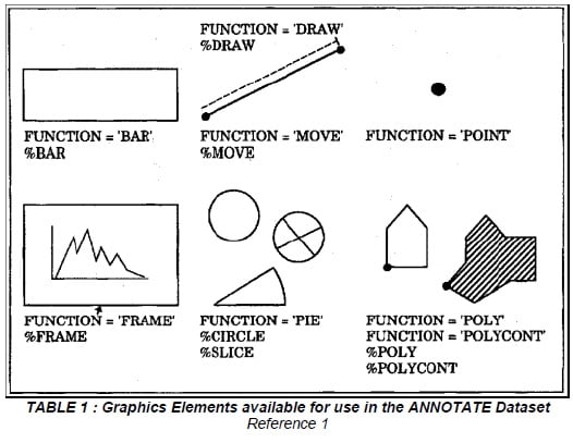
The Annotate option requires a dataset specifically designed to tell SAS/GRAPH how to enhance your current output. There are two basic functions which allow for moving and drawing, and other functions can be used to position labels, create bars, pies and polygons. The ANNOTATE dataset itself must have one observation per function and essentially tells SAS what and where to draw or place text.
The FUNCTION variable created in the dataset determines the graphics element that is drawn. The elements available are given in Table 1. Any of the elements given in Table 1 can be used to create a Figure. For the Forest Plot shown in Figure 1 we need only use the Move, Draw and Label elements to create the Confidence intervals and the text that is shown on the graph. The Hazard ratio bubbles are created as default and so no annotation is required for this.
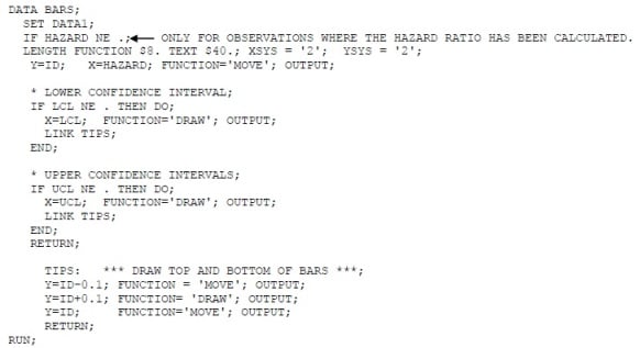
A simple example (showing the creation of the Confidence Intervals for Figure 1 above) is shown below. You can see that the code uses the data set that is to be graphed as a basis and adds the functions move and draw to tell SAS where to put the Confidence Intervals. The Confidence Intervals and hazard ratios have already been calculated and are stored in the dataset data1. The bars at the end of the Confidence Intervals are created separately to the actual Confidence Intervals.
The text on the graph is created using the label element function an example of which is given below.
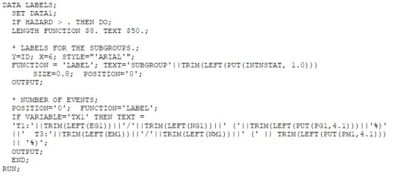
Each subgroup requires its own label function and so the code above would have several more label statements for the number of events.
The Confidence Interval and Label annotation datasets can then be set together to create a single annotation dataset which is then referenced within the graphical procedure as ANNOTATE= dataset name.
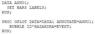
Axis, titles and footnote statements can be added to the GPLOT procedure as normal.
Macros
Due to the amount of detail required in the Annotate dataset programmers tend to prefer to modify the code for each output required. However sometimes ten’s maybe hundred’s of figures are required and so a macro would be the most efficient method to use.
The changes take place throughout the code including the code which creates the annotate dataset and dependant upon the changes across figures are quite minimal. All the cosmetics of the figure are controllable and the annotate dataset is created from your actual data and so can be adapted within a macro taking away the need for separate codes.
Examples of advanced macro parameters include toggling specific columns on or off, adding an additional statistics column (for instance, p-values or I² statistics), and drawing shaded reference bands behind the plot to enhance visual clarity. These switches empower users with flexible control over the plot’s appearance and the data presented, all while maintaining the efficiency and adaptability of a macro-based approach.
From this point the article assumes SAS version 9.2 TS2M3 or later with ODS Graphics enabled, which is required for SG procedures like `PROC SGPLOT` and GTL (`PROC TEMPLATE`, `PROC SGRENDER`). Users of earlier SAS versions can adapt similar visuals using the legacy Annotate facility.
Forest Plots Using ODS Graphics
While traditional SAS graphing often relied on the SAS/GRAPH Annotate facility combined with macros to create complex and highly customised plots, modern SAS graphics leverage ODS Graphics with procedures such as PROC TEMPLATE and PROC SGPLOT to produce polished, flexible, and highly customisable visualisations more efficiently.
Styling & Colour Customisation
An example of this is visual styles. Rather than relying on complex, low-level Annotate code to manage visual styles, users are encouraged to take advantage of high-level styling options available in ODS Graphics. These include:
- STYLEATTRS: Use this option to define consistent color schemes, marker symbols, and line patterns across plots. For example, STYLEATTRS DATACOLORS=(blue red green) specifies the fill colors for the graphics elements.
- MARKERATTRS: Control marker appearance directly within plotting statements such as SCATTER or SERIES. Options include SIZE=, SYMBOL=, and COLOR=. This improves clarity and allows fine-grained visual customization.
- Colour Palettes: SAS supports a wide range of built-in palettes (Grayscale, TwoColorRamp, ThreeColorRamp, Datalc, etc.) and allows custom color lists through STYLEATTRS.
- Footnote Callouts: For descriptive elements like legends or figure annotations, using FOOTNOTE statements or text inside SGANNOTATE provides cleaner, maintainable documentation within the figure eliminating the need for coordinate-based annotation.
By using these high-level options, you simplify the code, improve reusability, and make it easier to standardise appearance across multiple figures all without the overhead of managing manual Annotate datasets.
Reusable GTL Templates
Another powerful feature of ODS Graphics is the ability to define reusable templates using the Graph Template Language (GTL) via PROC TEMPLATE. These templates, when combined with PROC SGRENDER, allow users to apply consistent styling and layout across multiple Forest Plots with minimal repetition.
Templates can be made flexible and dynamic by declaring DYNAMIC variables. These act as placeholders for values that can be specified at render time such as plot titles, axis labels, reference line colours, and marker styles without modifying the template itself.
For example, dynamic variables like:
dynamic title xlabel ylabel refline_color;
can be used to inject customised content into a standard template for each plot. Then, when using PROC SGRENDER, these variables are populated based on your specific dataset or macro logic.
This approach enhances reusability and is especially useful when producing a large set of similar plots as often required in clinical trial reporting, meta-analyses, or subgroup analysis workflows.
Below are some examples of ODS Graphics being used to produce forest plots.
Example 1
This example demonstrates how to create a simple Forest Plot directly using PROC SGPLOT with ODS Graphics, without requiring an Annotate dataset. The data simulates a clinical trial with 200 patients, including covariates for age, treatment assignment, and smoking status.
The logistic regression is performed using PROC LOGISTIC, and the odds ratios with 95% confidence intervals are captured using the ODS OUTPUT statement. These results are then used as input to PROC SGPLOT to produce a Forest Plot.
/* Step 2: Run logistic regression and output odds ratios */
ods output OddsRatios=orci;
proc logistic data=trial_data;
class treatment(ref='0') smoking(ref='0') / param=ref;
model event(event='1') = age treatment smoking;
run;
/* Step 3: Produce forest plot using PROC SGPLOT */
title "Forest Plot of Odds Ratios from Logistic Regression";
proc sgplot data=orci noautolegend;
scatter y=Effect x=OddsRatioEst /
xerrorlower=LowerCL
xerrorupper=UpperCL
markerattrs=(symbol=diamondfilled size=8);
refline 1 / axis=x lineattrs=(pattern=shortdash color=gray);
xaxis type=log label='Odds Ratio (log scale)';
yaxis discreteorder=data;
run;
title;

Example 2
The following example demonstrates how to create a Forest Plot using PROC TEMPLATE and PROC SGRENDER with ODS Graphics. This example is adapted from an official SAS Knowledge Base article, which provides detailed code and explanation for generating customisable Forest Plots Forest plot macro:

PROC TEMPLATE allows you to define a statgraph template, specifying the layout and graphical components declaratively. You can control multiple plot panels, axis properties, reference lines, markers, and labels within a single template. Then, PROC SGRENDER applies the template to your data, rendering a polished Forest Plot.
Drawing a Diamond for the Pooled Estimate
In meta-analytic Forest Plots, the overall effect estimate is typically displayed as a diamond shape. This can be implemented in SAS using either:
HIGHLOWPLOT with a custom marker shape for the center point (e.g., a filled diamond),
or a second SCATTER plot layer, using markerattrs=(symbol=diamondfilled) and plotting it only once at the pooled value.
In the SAS Knowledge Base article code, the overall effect is displayed as a diamond using the following statement:
scatterplot y=studyvalue x=_or2 / markerattrs=(symbol=diamondfilled size=10) group=_grp
Using a Logarithmic X-Axis
Because odds ratios, risk ratios, and hazard ratios are multiplicative in nature, a logarithmic scale is often used for the x-axis. This centers the null value (i.e., ratio = 1) symmetrically, making it easier to assess relative effect sizes and direction across studies.
The log scale is applied in PROC TEMPLATE using type=log. For example, from the SAS Knowledge Base article code:
xaxisopts=(
offsetmin=0
type=log
logopts=(minorticks=true)
label="&PlotTitle"
display=(ticks tickvalues line)
displaysecondary=(label &border)
)
This configuration ensures appropriate axis scaling, adds minor tick marks, and maintains consistent labelling for clarity and interpretability.
Weight by Study Marker Size
In forest plots, the size of each study’s marker usually reflects its weight in the meta-analysis, giving a visual cue of its influence on the overall estimate. Typically, this is done by setting the marker size proportional to the study weight, for example:
size = weight;
In the SAS Knowledge Base article code weighting is implemented by adjusting the horizontal width of each marker based on both the study’s weight and its odds ratio. Instead of a simple size assignment, the macro calculates the marker boundaries using a logarithmic transformation of the odds ratio scaled by the normalised weight:
wt = WeightVar / 100;
_x1 = log10(oddsratio) - (log10(oddsratio) * wt * WtFactor);
_x2 = log10(oddsratio) + (log10(oddsratio) * wt * WtFactor);
Here, WeightVar is the study’s weight percentage, normalized by dividing by 100. The marker’s width on the plot expands or contracts around the log-transformed odds ratio, scaled by this normalised weight and a factor WtFactor.
This visual weighting is drawn on the plot with the following vectorplot statement, which creates a horizontal box representing the study weight by spanning from _x1 to _x2 at the study’s vertical position:vectorplot y=studyvalue x=_x2 xorigin=_x1 yorigin=studyvalue / lineattrs=GraphData1(thickness=8) arrowheads=false;
This approach helps emphasise the influence of larger studies, especially when odds ratios vary widely, by visually encoding study weight through the width of the marker.
Assessing Heterogeneity: I² Statistic
Meta-analysis also commonly reports a measure of heterogeneity to assess how consistent the results are across included studies. One such measure is I² (I-squared), which quantifies the percentage of total variation across studies that is due to heterogeneity rather than chance. Values of I² range from 0% (no observed heterogeneity) to 100% (high heterogeneity). In SAS, heterogeneity metrics can be extracted directly using the ODS OUTPUT statement. For example:
ods output HetQual=het;
This stores heterogeneity statistics including I², Q, and associated p-values into a dataset (het) for further analysis or for inclusion as an additional column in the Forest Plot.
Here is an example of a Forest Plot which has heterogeneity statistics. This plot is from a PharmaSUG paper, Using SAS for Forest Plots in AMNOG Meta-Analysis Reporting.

Conclusion
Forest Plots are a powerful tool for comparing treatment effects across subgroups or studies, and can be created in SAS using a variety of approaches. While the Annotate facility remains valuable for legacy workflows and detailed customisation, modern SAS procedures like PROC SGPLOT and the Graph Template Language (GTL) offer more efficient, flexible, and scalable alternatives. By utilising macros, ODS Graphics, and advanced styling options, programmers can produce publication-ready visuals that are consistent, customisable, and suited to both routine outputs and complex meta-analyses.
Quanticate’s statistical programming team transforms complex outputs, like forest plots, into clear, scalable visual summaries that enhance interpretation and support data-driven decisions. From macro-driven automation to modern ODS Graphics and meta-analysis-ready visuals, we help sponsors streamline reporting and meet regulatory expectations with confidence. Request a consultation below to see how we can support your next trial.
SOURCES
Reference 1 – www.sas.com
Reference 2 – https://support.sas.com/kb/43/855.html
Reference 3 – https://www.lexjansen.com/phuse-us/2021/dv/PAP_DV02.pdf


.png?width=140&name=cdisc_gold_partner_80h%20(2).png)
